
It’s October. My favorite month. Trees turn pretty colors and Halloween is at the end of the month. My neighbors decorate their houses like it’s Christmas and they’re cool with people walking on their grass to take pics.
And this year, I’m going to Comic-Con. For two days. Do you know how many years I’ve tried to get 2-day passes?!
I keep forgetting that I can get to Sleepy Hollow by train and that they go all out for Halloween. This year I actually remembered early enough and I’m doing a cemetery tour.
And, I have something special for you. I usually make one or two of my horror-y books available for free. This year I’m doing an anthology. It’ll be a collection of some of my published and unpublished horror/fantasy stories. It’ll be free this month. Sometime after October, it’ll be on sale.
So that means, time for a cover design!
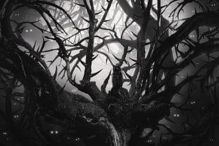
I looked at the images I already owned to see what I could do with them. I really liked this:
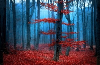
But couldn’t really think of what to do with it.
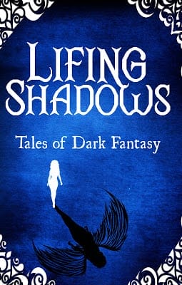
Next, I checked out some of my pre-made covers. This one specifically:
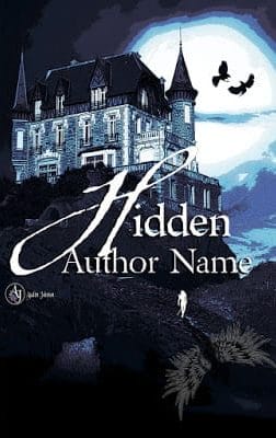
It’s nice but doesn’t speak to my story collection. Except…that female with the shadow. I needed more inspiration. I looked up dark fantasy and horror anthology covers. That didn’t really help except to show me the bar for cover design was pretty low in that department.
So, as usual, to Pinterest!
I looked up Halloween covers and noticed most were text-based. I do like those kinds of covers. They’re just difficult to design. Fortunately, I have a board for just such occasions.
I knew what kind of design I was leaning toward, now I needed images. Didn’t own any that would work out so I searched iStock and Shutterstock. I would need to limit my purchases to one image. I also searched the free stock photo site, Pixbay. They have some good free illustrations.
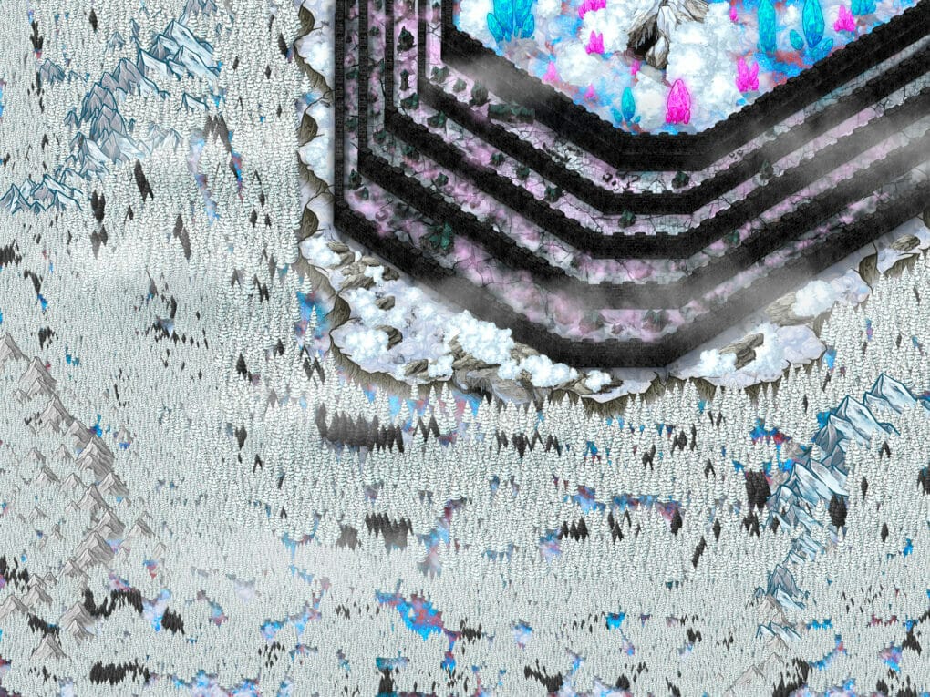
Found some images I really liked:
Pair it with some nice font. This could work. Fortunately, I already had Halloween-y fonts on my computer from when I designed The Unburned Island‘s cover.
Looks a bit too much like a children’s horror story. It also looks like a DIY cover. I really like the font for Shadow, though. This design was missing something.
I combined this:
with the cover.
Nice. But it’s not speaking to me. Might use it as a promo image, though.
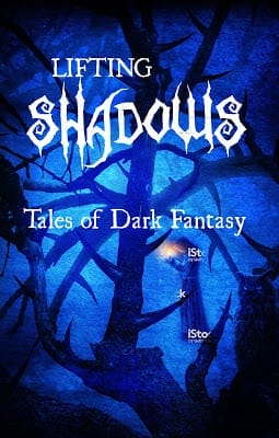
I looked again at my Pinterest boards. I noticed a lot of the text-based covers have decorative borders.
Much better.
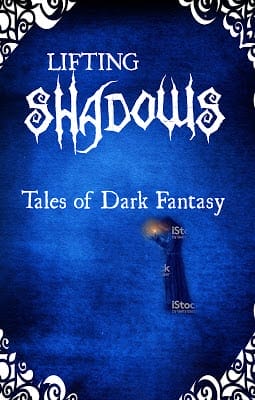
Although I like the Shadow font, it doesn’t work with Lifting. The points make it hard to pair it with anything.
Just FYI, the font’s called Zombie Apocalypse. You can download it for free from 1001 Fonts.
I think that font would fine if your title was only one word or if the second word was shorter like A or The. I tried making both words that Zombie font. Looked like a horror cliche.
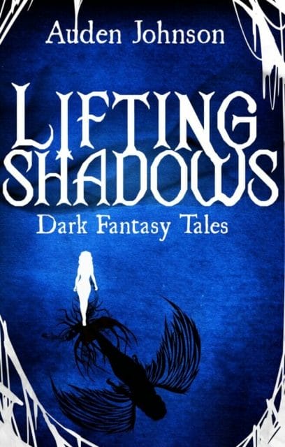
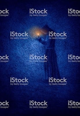
I like the blue figure but let’s go back to the shadow female.
Much better. The frame is nice but let’s see if we can find something better. I changed the frame added something extra to the female’s shadow and played with the font.
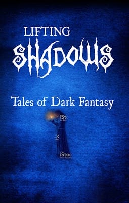
Here’s the cover for my next book, Lifting Shadows.