It’s time for another look behind the cover. My first non-fiction book Building Dark Worlds: A World Building Guide will be released in October.
The cover presented a new challenged. I knew I wanted to use this image.
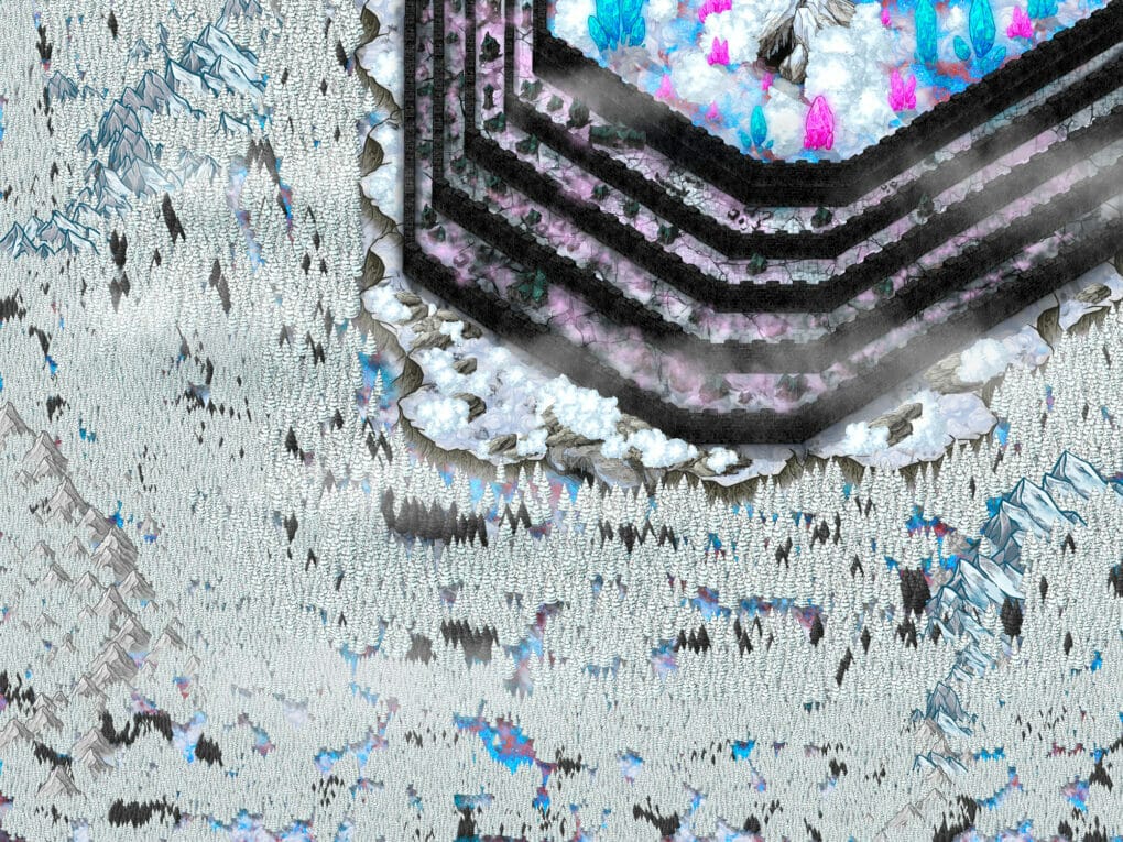
I’m gathering my posts about #worldbuilding to turn them into an ebook #amwriting #darkfantasy http://t.co/K8TusX1NEu pic.twitter.com/ECiCKY4m5M
— Auden Johnson (@audendj) April 1, 2015
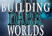
It describes a dark world perfectly. I tested the image on Twitter. That tweet got some good interaction and this was before I overhauled my Twitter account.
There’s one huge problem. This image is so…impactful. I didn’t know what to do with it. I’ve mentioned this before, I don’t like using unedited stock images for covers because there’s a chance someone else will have my cover. But, what do I do with this beast?!
I went against my rule and tried the image with just a nice font. The book was called Dark Fantasy World Building. More on why I changed the title later.
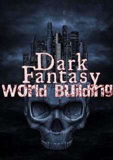
Meh. It’s fine but it wasn’t speaking to me. I needed a good image to pair with this- a background that wouldn’t make the cover too noisy. Before I started buying images, I first checked what I already had. This one spoke to me:
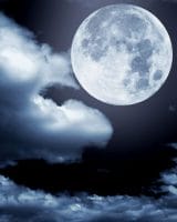
It’s a beautiful image without being too loud. This book cover was the first one I designed without spending any extra money. I already owned the images I needed!

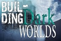
Alright. We’re getting somewhere. I played a bit with the clouds so it looked like the skull city was in the clouds instead of on top of another image. But, I showed the above image to my publisher and she wasn’t sold. She wasn’t a fan of the title.
For this book, I did a keyword search on Google adwords and Amazon and found that “dark worlds” was a popular search term. That phrase needed to be in my title. As I was compiling the posts, I realized the tips didn’t just apply to fantasy. Sci-fi world builders could use this book.

Without “fantasy” the title’s flow was way off.
Interesting, but I wasn’t sold. I stepped back from the cover since I wasn’t crunched for time.
I was watching a video on YouTube about book marketing. It started talking about covers and how some designers effectively used the spacing between letters for their non-fiction books. And a light bulb went off.
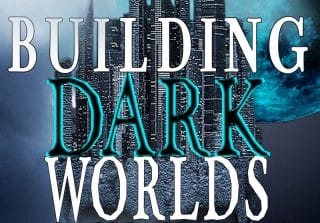
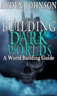
I started working on my cover again and came up with the title font you saw at the beginning of this post.
The video also said some authors put their names at the top to make the book look like a bestseller. If you look at the covers of any book on your shelf or on Amazon, 90% of the ones with the author’s name at the top are books by big name authors. The name is selling the book.
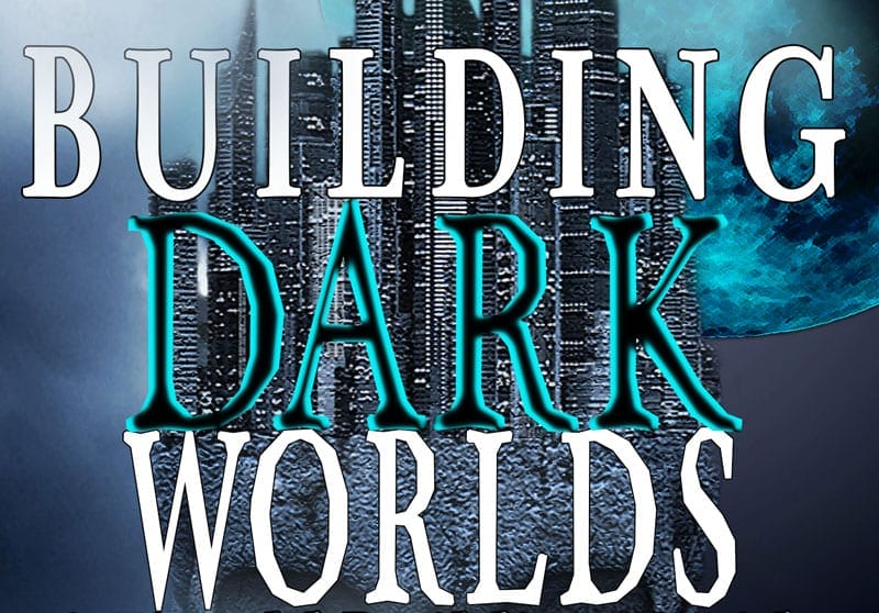
My name was at the bottom. It’s too hidden for my liking. So, I moved it to the top. Here’s the final cover!!
Opinions welcome!
The book will cover:
- Why do people like dark fiction
- Naming your world
- Finding inspiration
- Writing apocalyptic, post-apocalyptic and dystopain stories
- Creating a magic system
- Writing Anti-heroes/heroines and monsters
- and more