And now we’re back to our regular schedule…schedule. Sorry for being afk (got gaming on the mind from an anime) for over a week. Christmas threw off my blogging.
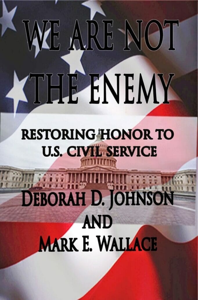
I recently completed a cover redesign for Deborah Johnson (my mom) and her co-author Mark Wallace. Last year, they published We Are Not The Enemy.

It’s about putting a positive spin on federal employees. People keep talking bad about the entire government when only a select group of people are crapping things up.
The authors are releasing an update soon. They wanted me to make a new cover. They wanted to it be “different with more focus on people.”
For those getting into cover design note, you will sometimes get vague requirements like this. It’s your job to ask the right questions to find out what they mean by “different.” I didn’t ask any questions because I’m new at this.
As usual, I did the cover in Adobe Photoshop.
I started with these stock images from Shutterstock:
They weren’t speaking to me. I searched again through iStock, Shutterstock and 123rf for stock photos. Again, nothing was speaking to me.
Like writing, when I hit a wall in cover design, I take a step back and do something else.
While commuting to class, an idea came to me. I don’t know where it came from. I must’ve seen something on the street that inspired me. I don’t remember.
The first cover was supposed to be people focused, so I have several images like these:


What if I turned them into patterns and put them in letters– in the title. This was born:
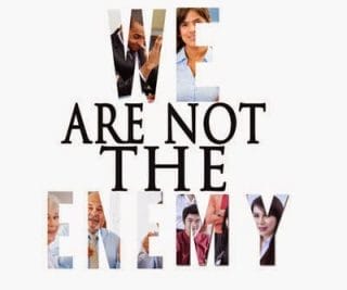
That’s four images inside the letters. I separated the words– made them into different layers. For “WE” the “W” and the “E” are separate so they can have different patterns. Similarly, for “ENEMY,” “ENE” and “MY” are separate layers.
I use four different images because I want the cover to be diverse, representative.
I didn’t use the pattern for “ARE NOT THE” because that would be a bit too much. An important element of cover design is focus–where you want people’s eyes to go. “We” and “enemy” are about people. They’re the most powerful words in the title. I gave them the pattern. “Are not the” also draws attention to itself because it’s different from the other words.
I played with Blending Options. As you can see, the patterns made the letters almost illegible.

This was an gamble. One of the authors doesn’t like wide fonts. But, the only way this would work was with a wide font. The author likes it. This entire cover was a gamble.
Then, I needed a background. I could’ve gone with a red or blue solid background. I tried it. Didn’t like it. In general, I don’t care for solid color backgrounds. They’re too flat.
I went back to the stock photo sites and looked at “government” images. I went to Amazon to examine other covers for books about the federal government.
The thing is We Are Not The Enemy isn’t just for government employees. I didn’t want it to scream government because it would turn off most of the target audience. On the other hand, its a book about the government. The cover can’t be so different it’s misleading.
I hit another wall.
I stepped back. Did something else.
Old parchment came to me. It’s government-y without being obvious about it. The background is simple so the overall cover won’t be too loud.

I like the burnt edges. It’s a good representation of the government and the themes in the book. The subtitle for We Are Not The Enemy is “Restoring honor to U.S. Civil Service.”
Here’s the final cover.